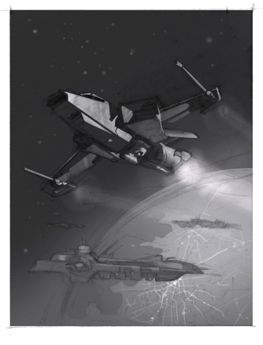
A lot of things have been limiting my art production. First, we had a baby. We didn’t really bother with anything but learning to be parents right after Halvor was born. Then Bethany went back to work, and I was taking care of him during the day. The little squirt barely let me shower and put clothes on, much less get a lot of painting done. Then when I finally started figuring out how to get some work done and had begun painting on this valkyrie piece, our apartment flooded. Luckily none of our stuff was seriously damaged, but after moving all our possessions back and forth trying to dry the carpet out, we eventually had to move out for a couple weeks.
Well, I’m back and I have an artwork to share.
I started this piece with the combined goal of making something nice (hopefully), and also testing to see if the oil painting with overlaid drawing technique from my folktale princess piece would be viable for book illustrations.
Concept:
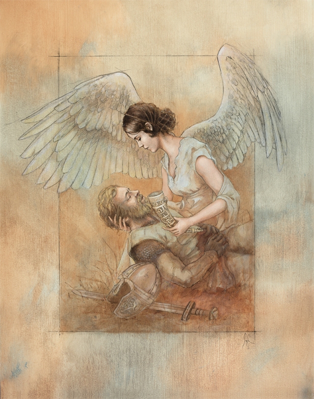
Not too long ago I had been listening to music from Wagner’s Ring Cycle and reading a little about Brunhilde and some of the other characters. I started to think that making a painting of a valkyrie or shield maiden would be cool. I sketched out some little ideas and started doing more research. I thought maybe I would have a woman all armored up and spearing people from horseback! Sounds pretty sweet right? But, the more I read the more my concept for this painting changed. That isn’t to say that the Norse epics don’t include plenty of foundation for a valkyrie staining the field of battle with the blood of her enemies. However, I started to focus more on the idea of valkyries enabling the transition of slain warriors to the immortal realm of Valhalla. I combined this with the idea of the valkyrie bringing drink to the warriors in the hall of the slain and decided to try to illustrate a tender valkyrie bearing mead from the gods to ease a fallen warrior’s final moments of life—a sort of rite—the last sip of mortality and the first taste of Valhalla.
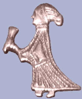
With this in mind, my idea of how she would look and dress also changed. I based her partly on this silver amulet from Sweden (found on Wikipedia):

I also decided to give my valkyrie wings. That was a decision I felt would help compositionally and would also easily distinguish her from mortal women. I’m not displeased with any connection that draws to depictions of Christian angels either.
Process:
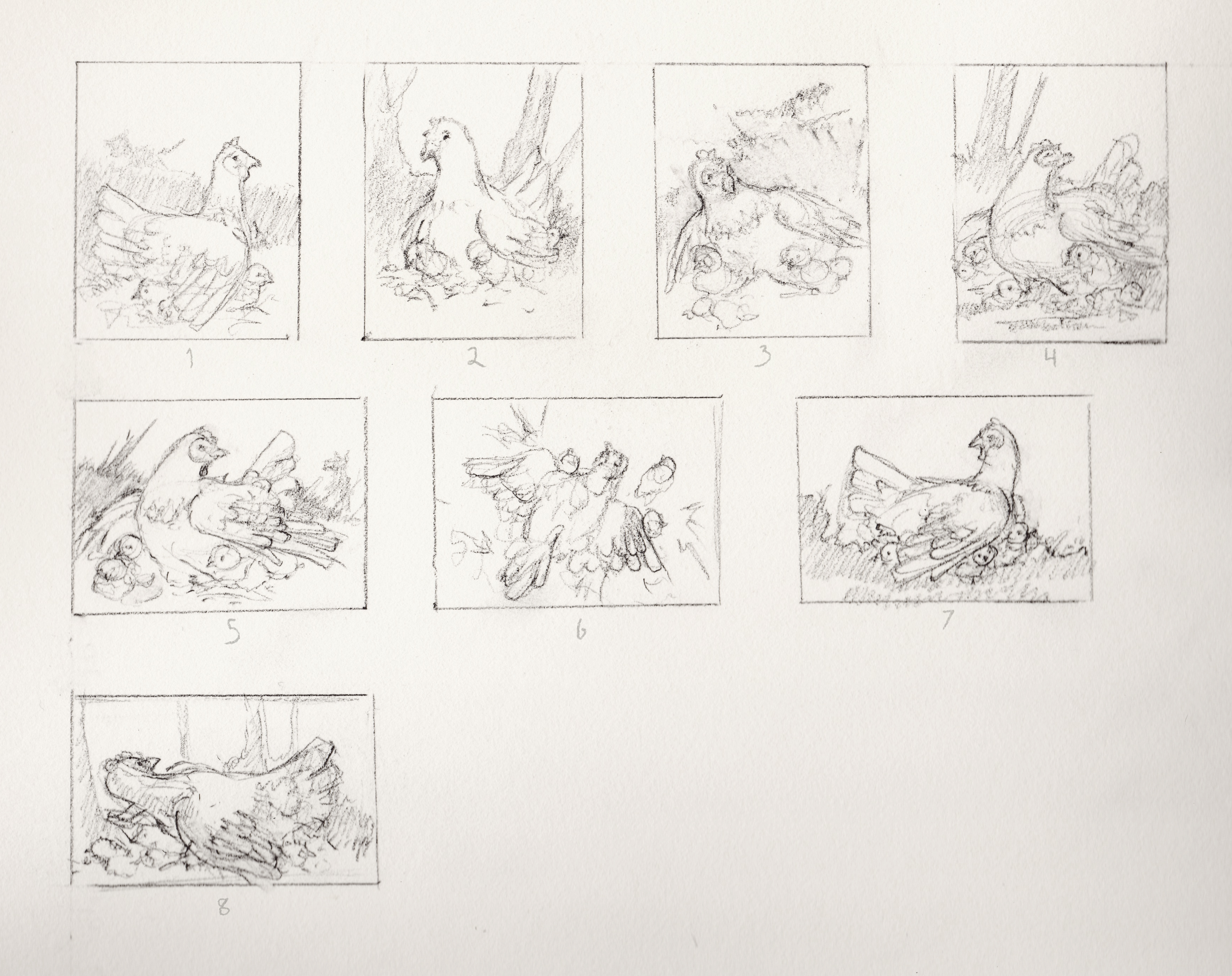
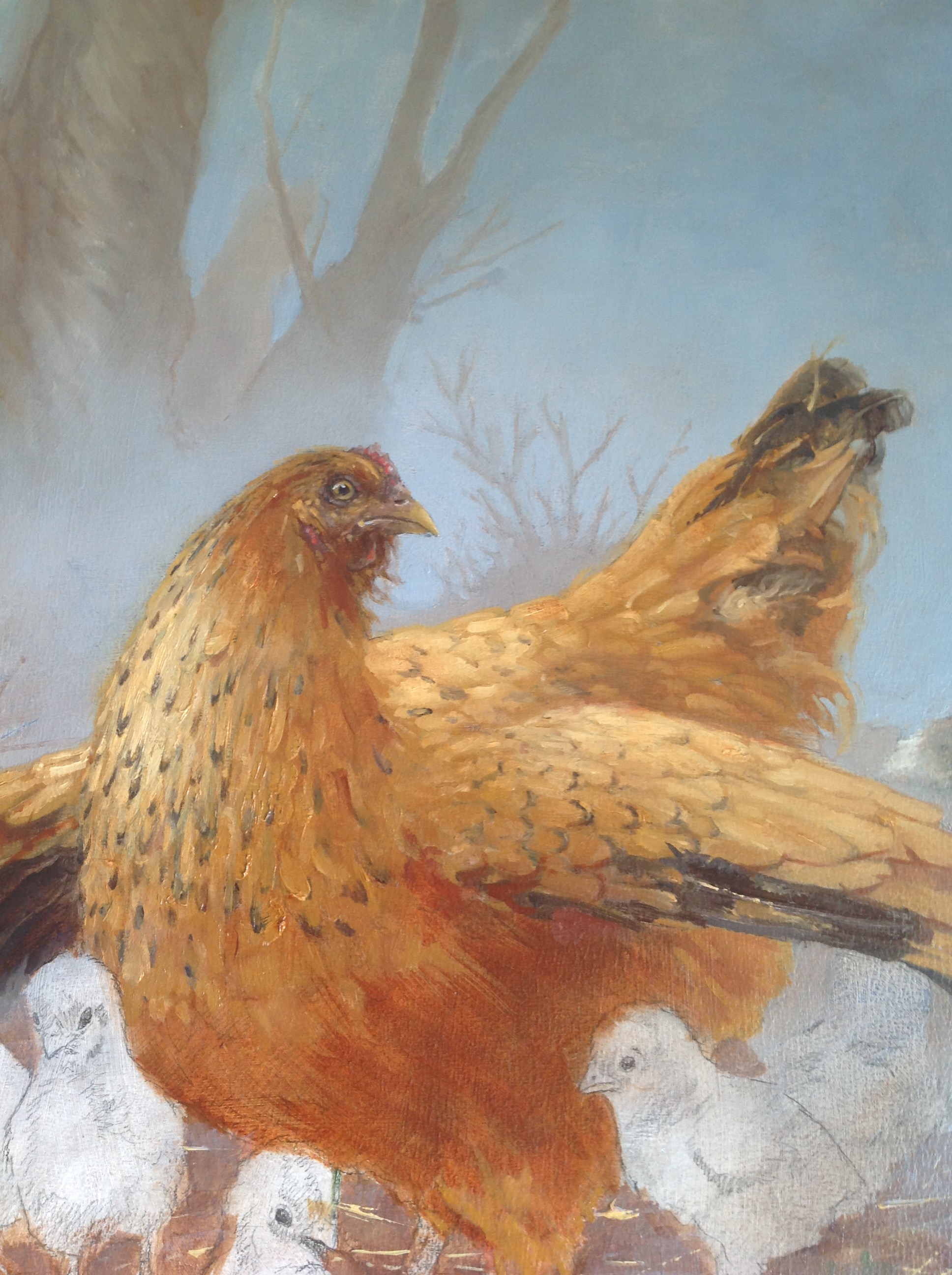
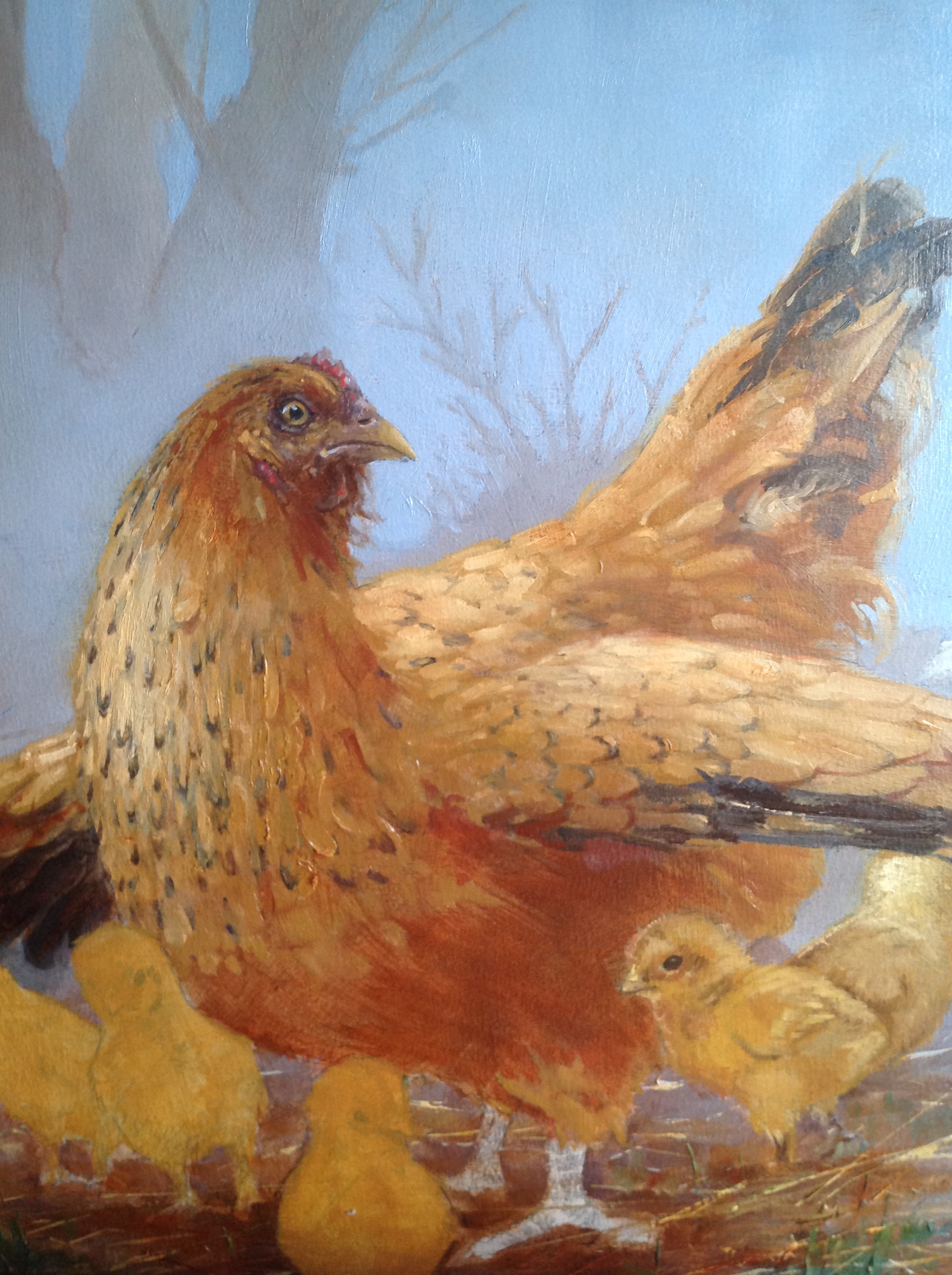
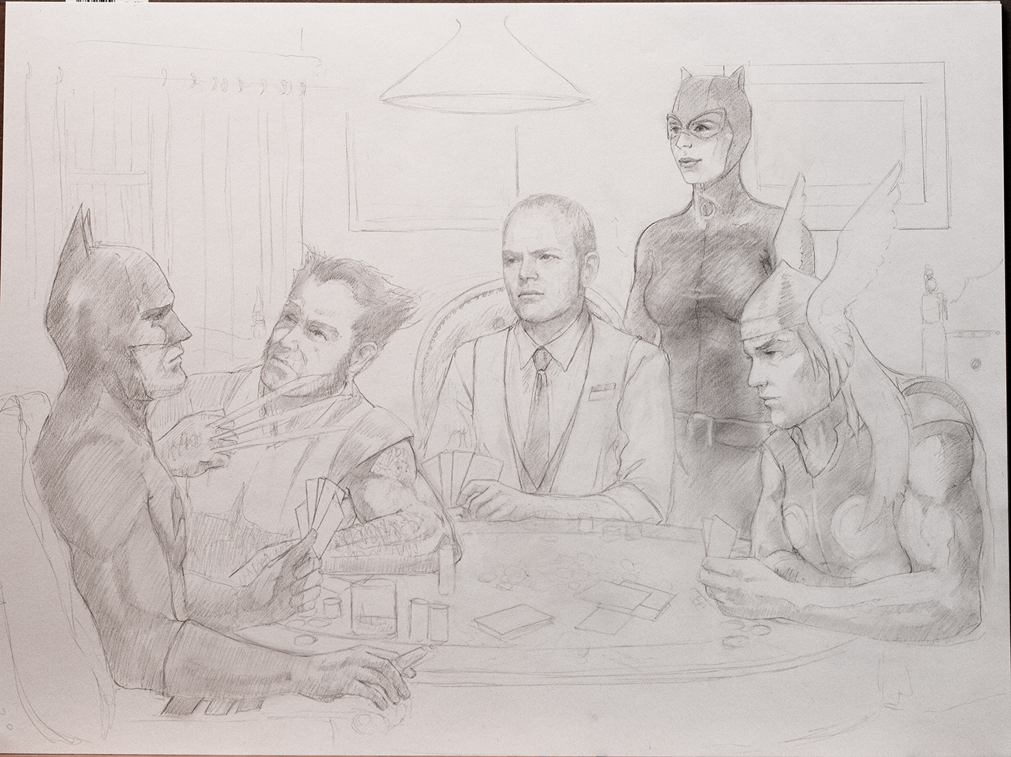
The process was very similar to that described in my post Painting a Princess. Only this time I planned from the beginning to bring the drawing back as an overlay. I began with a small sketch of the basic composition and then spent quite a bit of time compositing reference. Various vintage photographs from the internet as well as a few photos I took myself were cut up and combined into my composition. My preferred method is usually to shoot all my own reference, but, sometimes I get impatient if I don’t have models available. For just the valkyrie I ended up referencing 3 vintage photos, an eagle’s wings, my wife’s arms and hands and a grouse wing I happen to have around the house—similar story for the viking warrior (there is even a little bit of Elvis and a little Colin Firth in there).
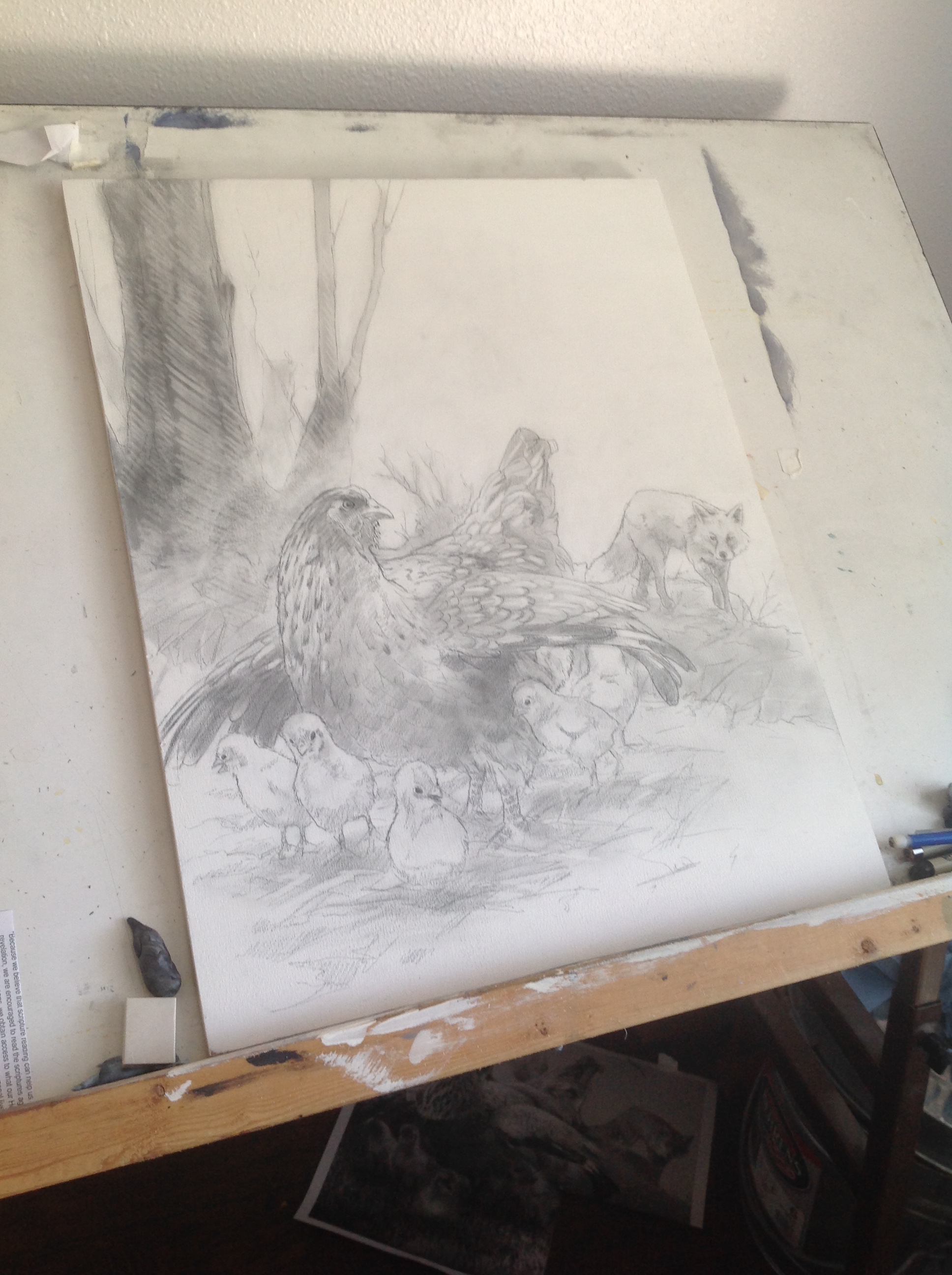
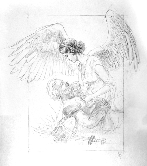
With all of my reference composited I did a pencil drawing.
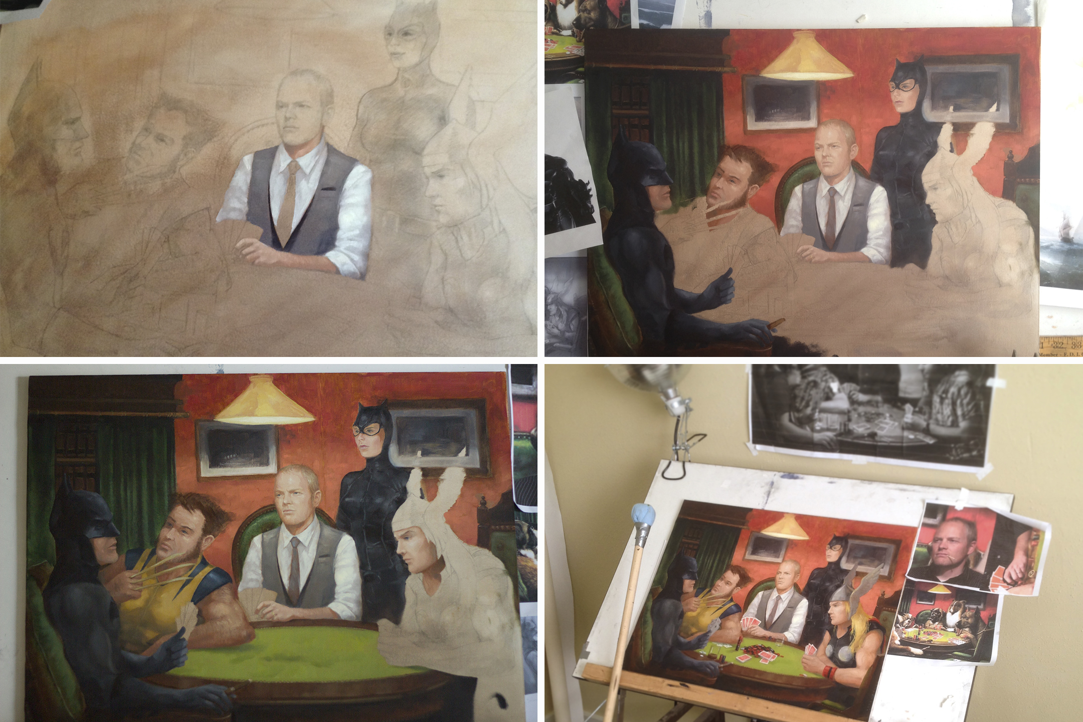
I then photographed the drawing and mounted it directly to a panel and sealed it with matte medium for painting. I sometimes use the photographs to make a print which I mount and paint on so that I can keep the original, but again, I was a little impatient. Looking back, I think a lot of those decisions on this painting were made with the baby’s schedule in mind.
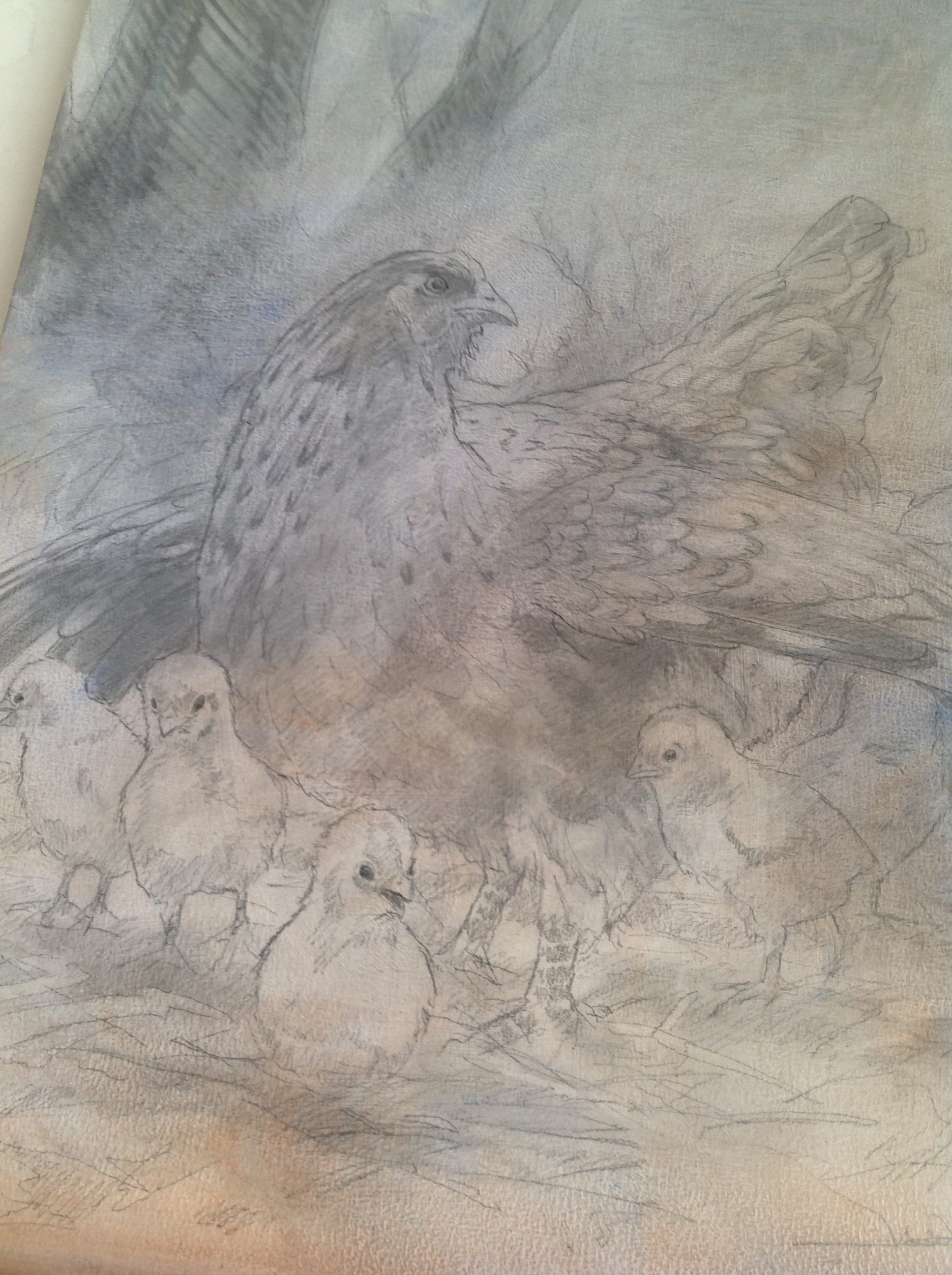
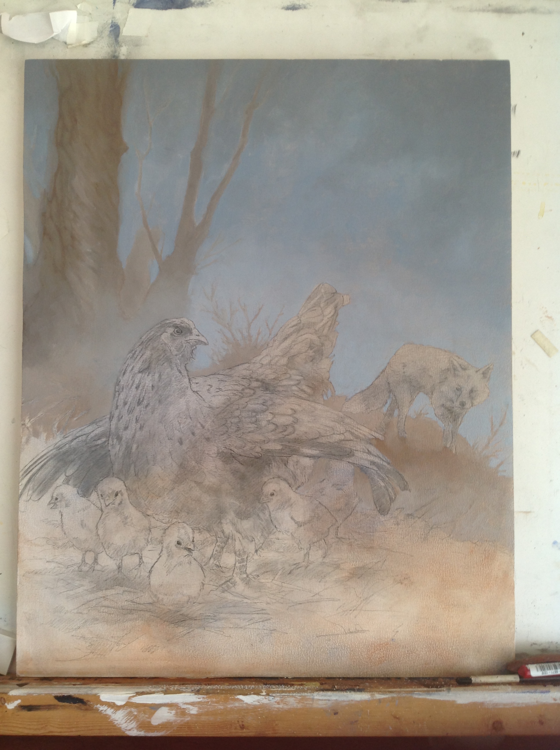
With the panel ready to go I began painting. I tried to include adequate detail and opacity in the areas of interest but also be a little more transparent farther from the center. The idea here is really just that I am more comfortable painting with oils and I like some of the detail and opacity for faces etc., but I want a sort of watercolory feel. Which is why, when finished with the oil painting, I photographed the whole thing and used my photos of the drawing to bring back the pencil lines that had been obscured by paint, but which would still be visible in a watercolor.
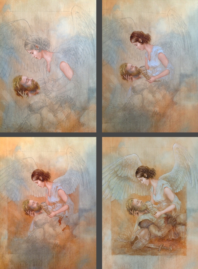
In order to get a really high res digital version of my painting without a giant scanner, I usually take it in 3 or 4 overlapping segments in landscape orientation. I left enough room around the edges and overlap, enough to be able to eliminate the vignette that my 50 mm lens creates. I used the 50 mm to minimize distortion ( the last thing you need when photographing artwork or even reference, is lens distortion.) I also usually take a shot of the full image to use as a guide when stitching them together, which I do manually (unfortunately, photoshop has never yet succeeded in putting my artwork back together without distorting it). I corrected any angle problems with the guide photo and made sure the dimensions and proportions were accurate. Then I scaled it up to the final size and brought in my higher res segments. I aligned them to the guide, which in this case was actually the photo of the original drawing, using the edit-transform-distort to drag the corners and line up all the details. I put the new layers on top at 50% opacity. This can take a little time depending on how easy it is to identify landmarks to align and how close they are to the corners. The closer to the corner you can align things the faster it will go. Then I manually merged the segments with layer masks and moved the drawing on top as a multiply transparency at around 55% opacity.
Even though I knew I would be overlaying the drawing to complete the image, I was a a little surprised by how much I like bringing the pencil back.
Hope you like it as well. I’m adding some prints of this to my inventory. The Etsy shop was sort of closed down when the baby was born. But if you can’t live without a print of this, I’m happy to take orders by email. Or, any Utah folks could drop by my booth at Sugarmont Plaza on July 23rd. Cheers!